

Understanding CSS Flexbox
A Deep Dive Into How Everything Works in the Flex Layout


Introduction
A core aspect of CSS you will use many times as a front-end developer is the flexbox layout. Flexbox is quite easy, yet, a lot of developers struggle with it as I once did.
One mistake many developers make is emphasizing more on learning various Flexbox values at the expense of understanding how the layout works in general.
Sure, knowing the various flex properties and their values is useful, but that's not the important part. The important things to understand are:
how to identify the main and the cross axis,
the components of a flex layout and the relationship between them,
the properties that can be applied to each component,
the properties that you can use to adjust the behavior of items on each flex axis (i.e. the main and the cross axis), and
the behavior of each property and how it can be adjusted to achieve the desired layout.
This article will address the important points listed above. It will also provide you with the right way to think about certain things in Flexbox.
Well, let’s get right into it.
Prerequisite
- Basic understanding of HTML and CSS
What is Flexbox?
Flexbox is a layout model that is useful for arranging a group of items in one direction. The direction may be a row or a column as opposed to the normal/default flow layout of:
Block - which only stacks items vertically (top to bottom), and
Inline - which only stacks items horizontally (left to right).
Flexbox gives tremendous control over the behavior of a group of items (as a whole), and each of the items in the group. It achieves this by using a flex container to represent the group of items and a flex item to represent each item in the container.
With Flexbox, you can:
Control the distribution of extra space among flex items in the container,
control the behavior of flex items as the size of the container is increased or decreased,
explicitly specify the gap that you want between flex items, among other things.
As you proceed in this article, you will discover more things that you can do with the flex layout.
The Flex direction property
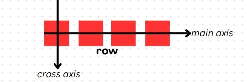
The flex-direction property specifies the direction of items in the flex container. It also helps to determine the main axis (or primary axis), and the cross axis (or perpendicular axis). This is one of the most important properties you need to understand, so pay attention to it.
The default value of flex-direction is row, but it can accept three other values as shown in this code
.flex-container {
    flex-direction: row | column | row-reverse | column-reverse
}
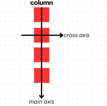
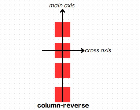
The main axis and the cross axis do not have a fixed direction. Their direction depends on the value that flex-direction is set to. If the flex-direction is:
- Row - the main axis spans horizontally from left to right, while the cross axis, is vertical (from top to bottom)
- Column - the main axis spans vertically from top to bottom, while the cross axis, is horizontal (from left to right)
- Row-reverse - same as when flex-direction is set to row. The only difference is the direction of the main axis which runs from right to left

- Column-reverse - same as when flex-direction is set to the column. The only difference is the direction of the main axis which runs from bottom to top.
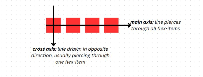
Bonus Tip: A Simple Trick to Instantly Identify the Two Flex Axes
You can use a simple trick to identify the main axis and cross axis. All you need to know is how to draw a simple line.
If you draw an imaginary line that cuts through the group of flex items, the direction that the line passes is the main axis.
To get the cross-axis, draw another imaginary line perpendicular to the main axis line.
The Components of a Flexbox: Flex container and Flex items
Understanding the relationship between these two is crucial to understanding Flexbox.
A flex container serves as a shell or box for the flex items. It is also the parent element that controls the layout and arrangement of the flex items inside it.
Just as a teacher controls the arrangement of students in a classroom, the flex container controls the arrangement of the flex items and can determine:
Whether the elements should be in a row or column (flex-direction)
the amount of space between flex items (gap, or justify-content)
whether the item will wrap into multiple lines (or not) if it cannot fit into one line (flex-wrap), and so on.
This does not mean that the flex items have no control of their own. They are like rebellious students that you can't completely restrict. They can determine:
Whether they want to grow or shrink to fill the available space (flex-grow/flex-shrink)
the order in which they want to appear along their direction (order)
their position relative to other flex items (align-self).
You're right, the italicized terms in brackets (in the bullet points above) are actual flexbox properties which we will soon discuss.
Content vs Items
Before proceeding to explain the various Flexbox properties, it is vital to differentiate between content and items. You will encounter these two terms many times when using Flexbox. Understanding these terms now will save you a lot of stress later.
Content - simply refers to a group of flex items that can be arranged along either of the flex axes i.e. main or cross axis. When you encounter this term, it refers to all the items in the container and not one item individually.
Items - refers to each item in a flex container individually. This term is usually found in flex item properties (which will soon be discussed) useful for directly targeting a specific flex item in a flex container.
Flexbox Properties
At this stage, you should already be familiar with how the Flexbox layout works at a broad level.
Here, we go into the specifics. You will learn about the various properties that you can use to move things around in a flex layout.
Pay special attention to the flex axes (i.e. main or cross axis) which the property explained can be applied.
Flex Container or Parent properties
These properties are applied to the flex container to control the arrangement or behavior of the flex item. They are:
display:
display defines the HTML element or the selector representing it as a flex container. This ensures that the elements under this container behave as flex items. A flex container can be any HTML container element like <div> or <ul>.
.flex-container {
    display: flex;
}
justify-content:
justify-content decides the arrangement of flex items along the main axis. It also helps to distribute extra spaces among flex items (along the main axis).
.flex-container {
    justify-content: flex-start | flex-end | center | space-around | space-between | space-evenly | start | end | left | right;
}

align-items:
align-items defines the behavior or alignment of items along the cross axis. Think of it as the equivalent of justify-content for the cross axis.
.flex-container {
    align-items: stretch | flex-start | flex-end | baseline | center | first baseline | last baseline | start | end | self-start | self-end
}

flex-wrap:
When there isn’t enough space to accommodate all the flex items on a line, flexbox tries to cram them together to fit that line. By setting flex-wrap to wrap, flex-items are pushed to the next line when there isn’t enough space.
.flex-container {
    flex-wrap: wrap | nowrap;
}
Check this codepen to see how it works
In the codepen above, change the flex-wrap property on the flex-container to see the effect.
align-content:
This property works only when you have flex items on multiple lines. This is usually due to setting flex-wrap to wrap. You should use this property instead of align-items when you have more than one line of flex items along your cross axis.
.flex-container {
    align-content: flex-start | flex-end | center | space-between | space-around | space-evenly | stretch | start | end | baseline | first baseline | last baseline;
}

gap:
This property allows you to directly control the space between flex items. gap is a shorthand property that represents both row-gap and column-gap (in that order). For example, If you set gap to
.flex-container {
    gap: 20px; /* represents both row-gap and column-gap */
    gap: 20px 45px; /* row-gap is set to 20px while column-gap is set to 45px */
  /* You can also set them explicitly */
    row-gap: 20px;
    column-gap: 45px;
}
You can play around with the gap properties in the codepen (in the CSS) below to see how it works
The gap property only specifies the space between flex items. Unlike justify-content, It does not control the space between the edge of the container and the first item (or the last flex item).

Properties For the Flex items:
Now that you know the flex container properties, you will learn about properties that can be used on flex items.
These properties control the behavior of individual flex items and not the group as a whole. Some of these properties are:
flex-basis:
This property works as the width or height of a flex item. When the flex-direction property is row, it sets the width of the flex item. Conversely, it sets the height when flex-direction is column.
Even though flex-basis works as width or height, it is different from the “width” or “height” in the default layout.
Flex-basis is not a fixed dimension that is always applied no matter what. It is more of a suggestion of what size the width or height of the flex item should be if there is enough space to contain that size.
For the normal width or height properties, if the container available cannot accommodate their size, the item will overflow i.e. jump out of its container. Whereas in the case of flex-basis, the item will try to fill all the space available in its container even though it will do so at a size smaller than its original size.
As an example, check this codepen
The above codepen shows one flex container and one normal container. In the CSS, each container was declared a width of 200px.
When we declare a flex-basis (representing width) of 300px on our flex container, it sits comfortably within it without spilling out. Conversely, when we set the width of our normal item to 300px, it overflows.
Play around with the flex-basis and width to get a hang of things.
NOTE
width property within a flex item will behave the same way as flex-basis. The only exception is that flex-basis can serve as either the width or height of the item depending on the flex-direction. For instance, by using flex-basis, the width of an item will change to its height when flex-direction is changed from row to column and vice versa. The same transformation is not possible when you use the width or height property within a container.flex-grow:
We said earlier that you can use justify-content for distributing extra space among flex items. What if you didn’t want to distribute the extra space but wanted a flex item to take it up? That’s where flex-grow comes in. flex-grow defines the portion or percentage of the extra space that a flex item should take up.
The word portion is important in this context. Any value assigned to the flex-grow on a flex item represents a portion of the extra space available. The flex item takes up that portion by “growing” to fill it. For this reason, flex-grow is better defined as the rate at which a flex item grows to take up extra space in the flex container.
Check this codepen
In the codepen above, make the following changes in the CSS:
Change the
flex-growofflex-item-onefrom 0 to 1 and see what happens. You can see thatflex-item-onenow takes up all the extra spaceChange the
flex-growofflex-item-twofrom 0 to 1 so that both flex items now have aflex-growof 1. This makes each item take up equal space in the container. To understand what happened, think of the value of each flex item as a ratio such that 1:1. In this context, the extra space available is 2 (1 + 1) and each flex item takes ½ of that portion.Change the
flex-growofflex-item-onefrom 1 to 2. This makesflex-item-onegrow twice as much asflex-item-two. That means the total portion is now 3 (1 + 2).flex-item-onetakes 2/3 whileflex-item-twotakes 1/3 .If you change the
flex-growonflex-item-twoto 2 (so that both flex items have an equalflex-growof 2), both items grow equally again.
flex-shrink:
flex-shrink is the opposite of flex-grow. It specifies how flex items should reduce in size due to insufficient space.
flex-shrink only takes effect when the size of flex items is higher than the size of the container. It specifies the rate at which each flex item “shrinks” (reduces in size) to make up for that deficit.
Like flex-grow, flex-shrink also defines the portion or percentage of the deficit space that a flex item should reduce from its size. Also, flex-shrink would be more accurately defined as the rate at which a flex item "shrinks" or reduces in size to settle any space deficit.
This codepen gives a better illustration:
Currently, the flex items don't fit within the container. Let's go to our CSS to find out why. In the CSS, the flex container has a width of 200px while each flex item has a flex-basis (which serves the same purpose as width) of 160px. Of course, the items are wider than the container and should overflow, but shouldn't they stay within the container since flex-basis is used?
Remember we learned that using flex-basis on an item within a container will allow the item to stay within that container. The reason for the overflow of items is that flex-shrink is currently set to 0 on each flex item!
By setting flex-shrink to 0 on both items, we're essentially saying that none of them should take up the deficit space hence the overflow of items.
Now that we've settled this potential confusion, make the following changes in the CSS:
Change the
flex-shrinkofflex-item-onefrom 0 to 1 and see what happens. You can see thatflex-item-onenow settles all the deficit space and the overflow no longer exists.Change the
flex-shrinkofflex-item-twofrom 0 to 1 so that both flex items now have aflex-shrinkof 1. This makes each item take up equal space in the container sharing the deficit equally. To understand what happened, think of the value of each flex item as a ratio such that 1:1. In this context, the deficit space is 2 (1 + 1) and each flex item takes ½ of that portion.Change the
flex-shrinkof flex-item-one from 1 to 2. This makesflex-item-oneshrink twice as much as flex-item-two. That means the total deficit is now 3 (1 + 2).flex-item-onetakes 2/3 whileflex-item-twotakes 1/3.If you change the
flex-shrinkonflex-item-twoto 2 (so that both flex items have an equal flex-grow of 2), both items shrink equally again.
order:
The order property specifies the order in which items are laid out in the flex container. By default, the order property of any item is 0. This means that the item retains its source order. However, this property can be adjusted to change the normal or initial order of a flex item.
The rule for using order is simple, the item with the least order value comes first in the container. Also, if all the items have the same order, they retain their normal position.
Change the order values of the flex items in the codepen below to see how it works
Games to Improve Your Flexbox Skills
Yeah! you heard me right. Certain games can make learning CSS Flexbox fun and engaging. I highly recommend the following:
Conclusion
Congrats on coming to the end of this article 🎉🎉🎉. I know, it's a lengthy article, but we can both admit that every piece of information in the article is relevant to your understanding.
You should know that the Flexbox layout is one of the most important things you need to master to conquer CSS. For this reason, I implore you not to stop at this article and go ahead to build projects and get your hands dirty using CSS Flexbox. Playing the games listed in the previous section can also solidify your understanding.
If you found this article informative, kindly drop a like ❤️ and leave your thoughts in the comments section. You can also share this article to help someone facing difficulties with CSS Flexbox. And lastly, follow me for more engaging content!
Good luck and happy coding!